Indeed, I am referring to reusable React components implemented using TypeScript generics. The advantages of this approach include a reduction in code redundancy, enhanced code clarity, improved maintainability, and, most importantly, the enforcement of type safety. We can now examine the implementation details with a select element.
import { useId } from 'react';

interface SelectProps<T> {
  label: string;
  options: T[];
  currentValue?: T;
  onChange: (val: T) => void;
}

export function Select<T extends string>({
  label,
  options,
  currentValue,
  onChange,
}: SelectProps<T>) {
  const id = useId();
  return (
    <div className="flex flex-col w-[100px] gap-2 my-4">
      <label htmlFor={id}>{label}</label>
      <select
        id={id}
        onChange={(e)=> onChange(e.currentTarget.value as T)}
        value={currentValue}
      >
        {options.map((option) => (
          <option key={option} value={option}>
            {option}
          </option>
        ))}
      </select>
    </div>
  );
}
The T in this component is a generic type, a placeholder that determines the type of the select options. Currently, it's restricted to strings (T extends string). Removing this restriction would allow T to represent any type, making the component more versatile. However, while flexibility is gained, it's important to remember that stricter type constraints, like T extends string, enhance type safety and code clarity. If, for example, your options were strings, T would simply be inferred as string.
interface SelectProps {
  label: string;
  options: string[];
  currentValue?: string;
  onChange: (val: string) => void;
}
The interface as is doesn't offer strong type constraints. But, by introducing a custom type, like type TradeType = 'buy' | 'sell';, we gain valuable restriction. SelectProps will then exclusively allow 'buy' and 'sell' as valid options, resulting in a more refined interface.
interface SelectProps {
  label: string;
  options: TradeType[];
  currentValue?: TradeType;
  onChange: (val: TradeType) => void;
}
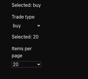
Let's use the Select component for choosing a Trade type.
// SelectTradeType component
type TradeType = 'buy' | 'sell';

export const SelectTradeType = () => {
  const [type, setType] = useState<TradeType>('buy');
  const handleUpdate = (value: TradeType) => {
    // ...
    setType(value);
  };

  return (
    <>
      <p className="mt-4">Selected trade type: {type}</p>
      <Select
        currentValue={type}
        options={['buy', 'sell']}
        label="Trade type"
        onChange={handleUpdate}
      />
    </>
  );
};
By defining TradeType as 'buy' or 'sell', we've enforced strict type constraints. Attempting to add 'both' as an option will demonstrate this. Your editor (VScode) will only suggest 'buy' or 'sell' for autocomplete, and will display an error, such as Type '"both"' is not assignable to type 'TradeType', highlighting the type mismatch.

When hovering over the Select component in SelectTradeType, the inferred type is Select<"buy" | "sell">, rather than Select<TradeType>. This occurs because the type is automatically inferred from the values provided to the component. To explicitly enforce the TradeType, you must manually assign the type to the Select component i.e
...
      <Select<TradeType>  <--- type assigned
        currentValue={type}
        options={['buy', 'sell']}
        label="Trade type"
        onChange={handleUpdate}
      />
...
Before

After

To extend the Select component's functionality to include numbers, the type of T in the Select component needs to extend either string or number i.e <T extends string | number>.
For more custom options, the Select component can be updated to
// Select
interface SelectProps<T> {
  label: string;
  data: { label: string; value: T }[];
  value: T;
  onChange: (val: T) => void;
}

...
        {options.map((option) => (
          <option key={option.value} value={option.value}>
            {option.label}
          </option>
        ))}
...
And changes required on the SelectTradeType component.
// SelectTradeType
...
      <Select<TradeType>
        currentValue={type}
        options={[
            {label: 'Buy', value: 'buy'},
            {label: 'Sell', value: 'sell'},
        ]}
        label="Trade type"
        onChange={handleUpdate}
      />
...
Finally, the UI!
